Project engagement
Design systems your team and your tools can use
A component library with tokens, docs, and typed APIs so clear that both your engineers and their coding agents use it correctly.
I build and maintain Lone Star UI and Rivet UI, and helped establish the pattern library at Indeed.
Who this is for
- Product teams whose UI is drifting: three button styles, four grays, no source of truth
- Startups moving from "just ship it" to "we need this to look consistent"
- Teams adopting AI coding tools that keep generating off-system UI
- Design teams whose Figma library and the actual codebase stopped agreeing months ago
What you get
- A token system (color, type, spacing) in OKLCH with light and dark modes from day one
- Typed React components with variant-driven APIs, built on accessible primitives
- Component documentation with live examples your team actually references
- Agent-ready conventions: props and patterns predictable enough that coding agents produce on-system UI
- Accessibility built in: WCAG AA contrast, keyboard navigation, focus management
- An adoption plan and migration path for the UI you already have
What an engagement looks like
System from scratch
Tokens, core components, and docs for a product that has design debt but no system. Scoped to the components you use, not a 50-component wishlist.
Brand-to-system translation
Your brand guidelines turned into a working token system and themed component set, so the brand survives contact with the codebase.
System rescue
An existing library that nobody trusts gets audited, consolidated, and documented until it is the easiest way to build UI again.
How it works
- 01
Scope call (free)
We look at your current UI, where it drifts, and what a right-sized system looks like for your team.
- 02
Audit and tokens
I inventory what exists, define the token system, and get agreement on the foundations before any components are built.
- 03
Components and docs
Core components land in prioritized batches with documentation, so your team starts using the system before the engagement ends.
- 04
Adoption handoff
Migration guide, contribution conventions, and a working session with your engineers so the system keeps growing without me.
Proof

Lone Star UI
A React 19 component library built with TypeScript, Tailwind CSS 4, and CVA (Class Variance Authority). Publishes ESM-only to npm with full type declarations.
Read the case study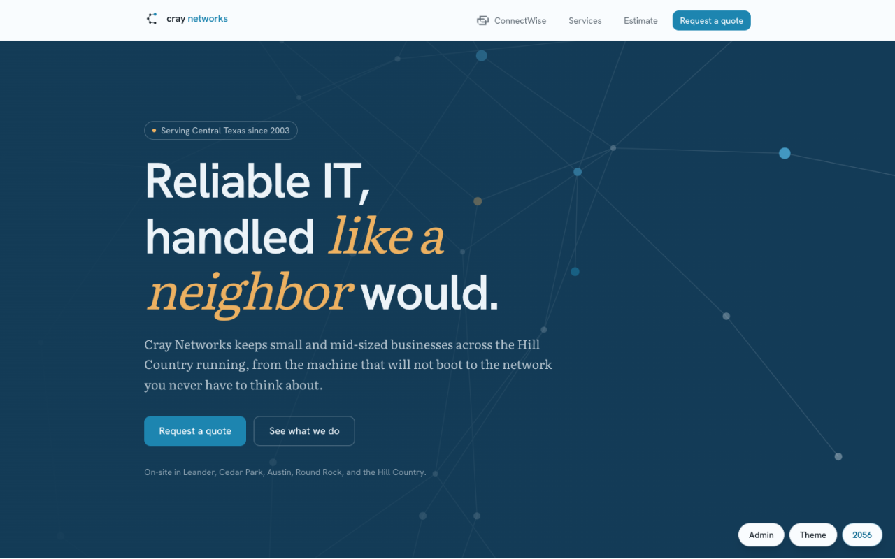
Cray Networks Rebrand
A design-engineering rebrand of a 20-year-old Central Texas IT shop, built around a live OKLCH theming engine and a Base UI design system.
Read the case studyCommon questions
What stack do you build on?
React, TypeScript, Tailwind CSS, and CVA for variants, on top of accessible primitives like Base UI. If your team is on something else, the token layer still transfers; we talk about it on the scope call.
What does "agent-ready" actually mean?
Typed, variant-driven component APIs with consistent naming and documented conventions. When the patterns are predictable, coding agents (and new hires) produce UI that looks like it belongs. Teams using AI tooling get compounding value from this.
Do you work with our existing Figma library?
Yes. If you have design files, I translate them into tokens and components and flag where the designs disagree with themselves. If you do not, I can define the visual foundations as part of the work.
How do you keep the system from dying after handoff?
The handoff includes contribution conventions, docs, and a working session with your team. Systems die when adding to them is harder than going rogue, so the engagement optimizes for the system being the easy path.
Start the conversation
The fastest path is a free 30-minute scope call. Prefer to write it out? Use the form and I'll reply within one business day.